
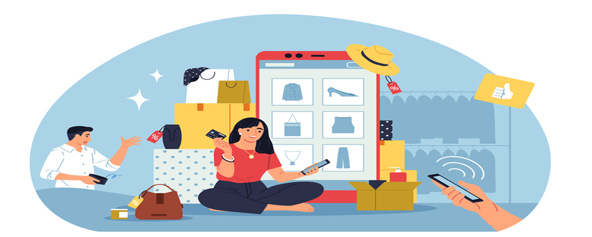
How to Create a Better Product Selection Experience in WooCommerce
Ever stood in a store holding two shirts and thinking why is this so hard to choose? Now imagine a shopper on your website feeling the same thing, except they don’t have the patience to stay. They click away. Gone. One second. One decision. One tiny frustration.
It happens in WooCommerce sites every day. A simple variation. A missing image. A confusing dropdown. Poof, customer disappears.
So, the real question is how do you make the product selection process smoother? Easier? Almost invisible? This is where the magic begins. And yes, it’s simpler than many store owners think.
Let me walk you through it. A story. A journey. But also a clear, practical guide.
We’re building something better. Something that feels natural.
Why Product Selection is the Quiet Deal Maker
Imagine a customer lands on your product page. They scroll. They stop. They want the red version. Or maybe the blue. Hard to say. The dropdown isn’t helping. The image isn’t changing. Something feels off.
They hesitate. That single moment, half a second even can change everything. Because the buying decision? It lives in tiny moments like that.
Three things happen when selection becomes simple:
- Decisions speed up.
Fast decisions feel good. No friction. No doubts. - Fewer mistakes.
Customers pick the right variation. Returns drop. Complaints shrink. - Higher confidence.
Clean UX feels trustworthy. Trust leads people straight to checkout.
When selection is messy, customers feel lost. When it’s smooth, they feel smart. Empowered even. And buyers who feel good buy more.
Step 1: Make Variations Visible. Really Visible.
Forget hiding important choices. Put them where eyes land naturally. Show colors clearly. Show images instantly. Show styles as small previews.
People are visual creatures. Use that.
What helps the most
- color boxes
- image swatches
- mini previews
- clean labels
- clear spacing
When the mind doesn’t have to guess, the heart says yes faster.
You can even use something like the WooCommerce variation swatches plugin, which adds an easy, visual way to pick options. A simple trick. But powerful.
Step 2: Turn Variations into Real Products
Sometimes a variation deserves its own spotlight. Like a color that looks totally different. Or a pattern that feels unique. Or a special edition. Imagine a shop where each variation shows up as its own item, standing proud. Red shirt. Blue shirt. Black shirt. Each on the shop page. Each with its picture. Each with its price. Customers see everything at once. No clicks. No dropdowns. Just clear choices laid out like a little gallery.
Why this works
- It grabs attention.
- It increases browsing curiosity.
- It boosts SEO through indexed variation URLs.
- It makes comparison extremely easy.
Your store suddenly looks richer. Sharper. More alive.
Step 3: Make Image Switching Fast
You click a color. The image doesn’t change. Now you’re confused. We’ve all been there. That tiny disconnect creates doubt. Is the option real? Is it out of stock? Is the store glitching?
Live image switching stops all that.
Fast. Instant. Clear. The moment a customer selects a variation, the image updates to match it. The gallery can swap too. A full set of photos for each choice. Not one generic image for all variants.
This alone can cut return rates because customers know exactly what they’re buying. Add a tiny “reset” button for clearing the choice. Easy. Helpful. Intuitive.
Step 4: Give Shoppers Options to Browse Their Way
Some shoppers want full product cards. All variations visible. Big pictures. Others prefer a tight dropdown list. Clean. Minimal. So why force one style? Offer both. Let them switch with one click.
Two modes that work wonders
Variation Mode:
Shows each variation as its own product card.
Dropdown Mode:
A compact, simple list.
Why offer both?
Because shoppers come in different moods. A flexible store sells more. And the moment customers feel in control they stay longer.
Step 5: Use Quick View Popups
Let me tell you another small story. A customer is scrolling your category page. They like a product. But clicking and loading a full page? Argh. Too slow. Too tiring. They’re browsing casually. They don’t want a journey. They want a peek. That’s where Quick View helps. A small popup. Clean. Crisp. Fast.
What Quick View gives customers
- variation selectors
- updated images
- price
- gallery
- add-to-cart button
- short details
No page loads. No interruption. Just a little window that keeps them in the flow. It feels modern. Smooth. Stores with it look instantly professional.
Step 6: Use Clear Attribute Labels
Labels guide customers like a signboard on a road. If labels are confusing, the whole trip feels messy.
Keep labels simple
- use short words
- avoid technical jargon
- don’t repeat info
- don’t use strange formatting
- align everything clean
Clarity beats cleverness. When labels feel human, customers follow them without thinking.
Step 7: Use Helpful Swatches and Visual Options
Text-only variations? They feel old. Visual swatches? They feel alive. Show patterns. Show shapes. Show textures. Show whatever makes the product unique.
This is where attribute swatches shine. They give customers instant understanding of what they’re selecting. And understanding builds confidence. Confidence builds sales.
Step 8: Hide Variations That Don’t Belong on the Shop Page
Some variations don’t need to appear publicly. Too similar. Too boring. Too low-stock. Or just not meant for browsing. Showing everything clutters the page. Clutter creates stress.
So, hide the ones that don’t matter.
Keep the shop page sharp. Only show variations that feel important or exciting. Less noise. More clarity.
Step 9: Make Variation Pages SEO-Friendly
A lot of store owners don’t know this, but variations can rank in Google, just like full products. Imagine a customer searching “red cotton hoodie medium.” If your variation page is indexed and optimized, it can show up on the first page.
How to boost variation SEO
- write short variation-focused descriptions
- use clear titles
- add unique pictures
- use meaningful slugs
- improve structure
Tiny SEO improvements bring long-term traffic.
Step 10: Make It Mobile-Friendly
Most people shop from their phones now. Small screens. Tired thumbs. Quick scrolling. Short attention spans.
Mobile UX must be perfect
- bigger buttons
- easy swatches
- fast image loads
- smooth gallery tap
- simple dropdowns
- short spacing
If your mobile variation flow makes sense, you win half the battle. A store that behaves well on mobile feels instantly trustworthy.
Step 11: Keep Navigation Predictable
Don’t surprise customers in weird ways. If variation controls jump around, customers feel uneasy. Predictability creates comfort.
Keep things steady
- same placement
- same sizes
- same color theme
- same update behavior
- same spacing
Your store becomes easy to memorize. Memorable stores convert better.
Step 12: Reduce Clutter Like a Pro
This part matters more than people think. Too much text? Gone.
Too many borders? Remove. Random spacing? Fix it.
Long paragraphs? Shorten. Clutter drains mental energy.
A clean product page feels fresh. Customers breathe easier. They scroll slower. They explore more. Focus the layout on the product. Everything else should support it, not compete with it.
Step 13: Tell a Visual Story with Each Variation
People don’t buy products. They buy how those products make them feel.
Show lifestyle photos.
Show close-ups.
Show colors in natural light.
Show textures that feel real.
Each variation can tell its own tiny story. A mood. A feeling. A style.
Give customers a sense of identity with the variation they pick. They’ll connect to it emotionally. And emotion sells.
Step 14: Keep Testing Your Selection Flow
Nothing stays perfect forever. Trends change. Customer habits shift. Devices evolve. So, test your variation experience often.
Test these things
- speed
- clarity
- button sizes
- image load times
- mobile gestures
- light/dark backgrounds
- cart behavior
Every test reveals something. Every improvement builds smoother flow.
Conclusion
A better WooCommerce product selection experience isn’t about fancy designs. It’s about human behavior. Small moments. Tiny decisions. Little bits of clarity that guide shoppers softly toward the purchase button.
When you show variations clearly, update images instantly, offer flexible browsing, add Quick View, hide clutter, and make everything mobile-friendly… your store becomes a place where buying feels effortless.
Customers feel guided, not forced.
Curious, not confused.
Confident, not doubtful.
And that’s when your store stops being just another site and becomes a place people enjoy shopping in.
Comments are closed